Thursday, February 7, 2019

Scrap the Boys DT - February 2019 - Make Waves

Hello Scrappy Friends, welcome back to my blog today
 where I'm sharing a DT layout for
Scrap the Boys.


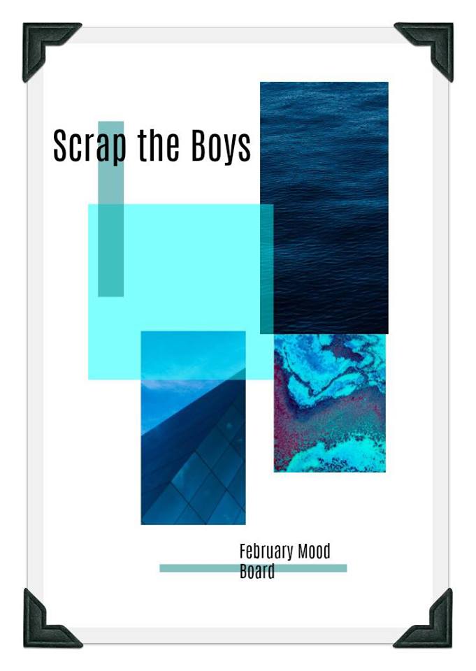
The mood board can be used any way you like. The image on bottom right looked like waves at Middleton beach over the Christmas break, so   
I've chosen to go with a beach theme.   It also ties in beautifully with the 
cut files provided by Gwen Wruck.  Thank you so much Gwen.


The background paper is from Cocoa Vanilla, 
You Rock Collection, "Experimental". I also used a die cut and a flair from that same collection.


I popped the middle out of the alphas and painted them with Liquitex glass beads before sprayings them with Heidi Swapp Color Shine teal.


They have a lovely shimmery, bubbly look and feel IRL.


The waves were treated with the Liquitex glass beads as well and then sprayed with Tattered Angels, Simply Khaki.   The chipboard is from Scrapmatts and the little beachy stickers have been in my stash for at least 15 years!  So lovely to get them onto a page at last.


I hope you will feel inspired to play along and be eligible for a prize if you are in Australia, or a Guest Spot if you are from overseas.

I appreciate your kind comments and so enjoy reading them.  Thank you.

Scrap Matrix February 2019 - Helen's Mini Book

Welcome back to the Scrap Matrix challenge this month 
where we don't have a mood board to inspire you.
That's because the team has been asked to work with minimal supplies and mine are photographed below.


I had a stamp, a stencil, Dylusions Paint, Dylusions spray

and Dina Wakley Acrylic paint.

 To this bundle of supplies, I added two pieces of patterned paper and some heavy chipboard.

 I decided the best way to combine them all was to make a mini book. Not something I'd done before, but I made a little template out of paper to see if my idea would work. 


It's my Grandson's final year in Primary School this year and I wanted to make him a little book of positive affirmations.

This paper from Pink Fresh Studio,
 Escape the ordinary collection, "Search" had just the kind of thing I was looking for.


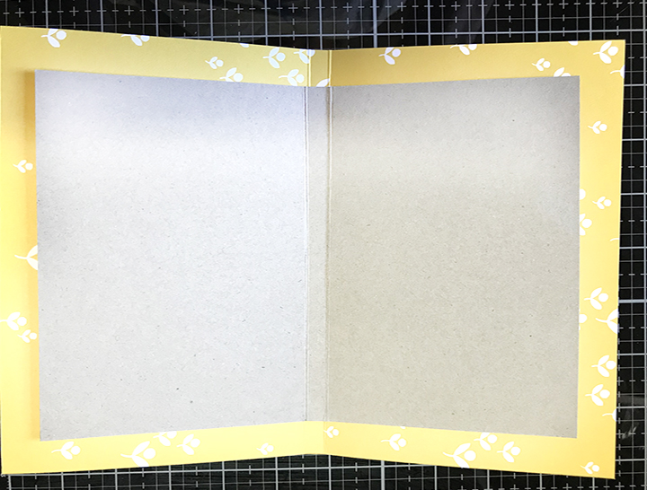
I cut some heavy chipboard 23 cm x 15 cm and scored a 
1 cm spine in the centre.


Using Pink Fresh Studio, Indigo Hills, "Pinnacle", patterned paper, I cut a piece 27 cm x 19 cm and folded the edges in.


I trimmed a notch out of each corner and burnished the folds
firmly with a bone folder.


Using a strong wet glue, I adhered the paper to the chipboard.


A plain grey lining completed the cover.


The cover was decorated with dies from Pink Fresh Studio, 
"Escape the ordinary".  These die sets are such good value for money; I've used them on 4 or more layouts, several cards, now this mini book and there are still lots left in the packet.


On the first page, I had yellow and brown paints to use, neither of which, were the colour I was looking for, so I blended a bit of each to make this mustard yellow.  Using the first of many Tim Holtz stencils, I sponged a pattern around the edge, before adhering the butterflies and stamping "love you" with AALL & Create #14 stamp with Tim Holtz black archival ink.


My Grandson is smart and witty, but sometimes school get's a bit overwhelming.  I wanted him to have a little book of affirmations in case things got too demanding this year. 

This Fingerprint Stencil by 13@rts, made me think of his unique qualities and I wrote a little message in between the fingerprint lines.  I used texture paste through the stencil and then sprayed some watered down "Dirty Mojito" Dylusions ink while it was still wet.  On the opposite page, I used a Tim Holtz stencil, "Dot Fade"


How are you going?  It's a long post, so you might like to get a cuppa!  On this page, I used an AALL & Create stamp, #14 and another Tim Holtz stencil 004, This time I used Distress Oxide inks, Fired Brick and a little Map Marker from the die cuts,  I just doodled to create a border on the opposite page.


This is the middle page; using more die cuts and a Star Stencil from Tim Holtz.  The Dirty Mojito Dylusions spray, that I had to work with was too dark and to blend with the green dies, so I just added a few drops of blue in a mini mister to get the right shade.


I love this stamp set from AALL & Create #14.  It works brilliantly for this Grand Boy, as he is fascinated by Geography, loves to draw maps and has a great eye for detail.  The little stars and the map marker are from the same die cut set and the blue stencilled pattern is from, yes, you guessed it, Tim Holtz S082.


Nearly at the end, well done, if you are still with me!
Using texture paste through yet another Tim Holtz stencil, "Eye Chart", I smooshed some Tim Holts Distress Oxides over the top.  I highlighted his initial, the year level and his age with a Fude pencil.


Finally the last page. Yay!
One more Tim Holtz stencil S075 to decorate the corner and it's finished.  You can see the way I attached the signature to the spine here.  I used my Cropodile to punch some holes and then threaded some silver elastic through, fastening with a bow at the front.

I hope you find time to play along, just add your entry to the Scrap Matrix Shares page in the corresponding folder and don't forget to let us know what Scrap Matrix products you used and what inspired you.  You could be in the running for a generous gift voucher and perhaps a Guest Design Team spot down the track.


Scrap Matrix Products used:-
13 @rts Stencil, Finger Print
Finnabair Texture Paste
Tim Holtz Stencils
Tim Holtz Distress Oxides
Tim Holtz Archival Jet Black ink
AALL & Create #14 Stamp
Dylusions mist, Dirty Mojito
Dylusions acrylic paint, Melted Chocolate
Dina Wakley acrylic paint, Lemon
Pink Fresh Studio, Indigo Hills, "Pinnacle"
Pink Fresh Studio, Escape the ordinary collection, "Search" 

Saturday, January 26, 2019

Scrap Matrix DT - January 2019 Year in review

Happy New Year - I wish you good health, happiness 
and lots of creativity throughout 2019.

The Scrap Matrix mood board this month 
is eclectic, with lots of different ideas to inspire you.

The theme is a Year in review, so you can take this
pretty much any where you want.


I should warn you that this is a long post, so you might like to get a cuppa before you start.
The team has been gently coaxed into trying a double pager, multiple photos or both; something I agreed to willy nilly.
Huh!  Silly me.  Lol. 


 I seemed to have forgotten all the rules, was bereft of ideas 
and numerous pages ended up in the bin. 
Luckily one of my wise team mates advised me to just step awaaaay 
from the desk and that did the trick. 

My project is about various events in my Grand Daughter's life during December 2018.


To begin with, I chose three colours from the clothes in the photos and created some backgrounds with a gel plate and some Paper Artsy paints. Doesn't sound too hard does it, but what a mighty mess I made until I remembered what to do.


This photo was taken before the yellow was added to the gel plate, but you can see it in the middle of the first pulled print below.

I simply placed a piece of card stock down on the rolled paint, smoothed it out firmly with my hands and pulled it off the gel plate. 

 Ta Da!   Or some times - Oh no!
I never know what the result will be and that's part of the fun.


Using a Paper Artsy Stencil- PS110, I roughly dabbed some of the purple paint onto the green and trimmed it into a squarish shape.


I lined up the stencil so I could continue it off the background and onto the card stock, then I outlined the petals with a gold pen and doodled around the frame.


Some more stamping with Carabelle "Et rond et roads" and stencil work with a smaller Paper artsy stencil, PS111.


A gorgeous stamped butterfly, Paper Artsy ETS22, some stamped words, Paper Artsy EEA03 as well as some pops 
of red to tie in with the red on the other page. They embellishments are from Pink Fresh studio, Gold foiled die cuts.


Now for some - yes - you guessed it - some more stamping!

I'm a big fan of Carabelle stamps - this one is 
"Textures: Mini Fleurettes. I added some bunches into the corners.


To obtain the patterned circle under the photo, I brayered some green and purple paint onto the gel plate, then placed a the Paper Artsy stencil into the wet paint, layered a piece of card stock on top, burnished the card stock well with my hand and then pulled the card stock off to reveal the monoprint.


The purple flowers in the corner have faded a bit here, due to me whitening the whites, but in real life they are crisp and pretty.

Did you notice the sweet butterfly stamp, Paper Artsy, ETS21 with the golden prills in the centre? and the pretty brass heart shape that matches my girl's dance trophy? 


This photo shows you what the mono print looks like before it's trimmed and dressed.  One more butterfly again from Paper Artsy, this time from ETS22. 


Phewww!  Are you still with me? Thanks for staying until the end. I hope you found something to intrigue and inspire you to get messy with your paints and stencils.

I hope you find time to play along, just add your entry to the Scrap Matrix Shares page in the corresponding folder and don't forget to let us know what Scrap Matrix products you used and what inspired you.  You could be in the running for a $30.00 gift voucher and perhaps a Guest Design Team spot down the track.


Other Scrap Matrix Products used:-
Gelli Arts Press
Tim Holtz Glass Mat
Tim Holtz Archival ink
Tim Holtz Distress Oxide inks
Scrap Matrix DT - Year in review 2nd project with Helen

Welcome back to the Scrap Matrix challenge this month 
where we have an eclectic mood board to inspire you.


You can take this challenge pretty much where ever you want,
 it's so versatile.

Once again, the team has been cajoled into using multiple photos,
so I specifically took heaps of shots on Christmas day.


I decided to keep it simple and create frugally as I did years ago.  One sheet of paper and a few scraps is all I used.

I'm such a fan of this paper collection, 7 Dots, paint chip collection, "Aquarmarine"  What better for photos at the beach.


I used some old dies from my stash, to partially frame the photos.

The titles and stars are all from a Pink Fresh Studio, 
"Escape the ordinary" die cut set. 


It's was lovely to see the Cousins enjoying each other's company.
The Photo App tag is from Mambi chips, "Vacation". 


I used the Carabelle stamp, "Bulles d'eau",  because it reminds me of the bubbles in the sea, the champagne we drank and the effervescence of the children.


Here, I'm trialling the elements in various places on the paper.


I decided to type my journalling on white card stock, so that it would stand out from the background. But then it looked too stark, so I pulled out some Tim Holtz distress Oxides.


Testing how the colours blend and checking that they will look OK on the background.   I keep these little test swatches with the Oxides in case I need the same combination later on.


Before I separated the lines of text, I smooshed the card stock through the Oxides and dried it white a heat tool.


Later I flicked on a bit of extra green Oxide.

I'm happy with this photo journalist style of page, it narrates the Joy of the moments in an inexpensive and simple way.

How about you, do you have a group of photos you'd like to get scrapped?   I hope you've found some inspiration here and will play along.

Just add your entry to the Scrap Matrix Shares page in the corresponding folder and don't forget to let us know what Scrap Matrix products you used and what inspired you.  You could be in the running for a $30.00 gift voucher and perhaps a Guest Design Team spot down the track.


Tuesday, January 1, 2019

Scrap the Boys DT - Jan 2019 Summer Treats

Hello Scrappy Friends, welcome back to my blog today 
where I'm sharing a DT layout for
Scrap the Boys


This mood board had me longing for ice cream in a cone, and I had the perfect photos for this challenge.


Mr Mojo had disappeared with the Christmas wrapping, so I flicked through some of my albums, found a page that I'd created a while ago, adapted it to suit my photos and things fell into place.

My punches came out for a play to border the photos.  The "Train Edge" is by Martha Stewart and the "Upper Crust" is by Fiskars. 


The background paper is from Simple Stories, 
the Summer Days collection, "Soak up the Sun".

The little heart embellishment is from Pink Paislee.


I've tucked two flairs in at the top, "Note this" is from A piece of Cake designs and the Camera flair is from Basic Grey.

The little ice cream cone and the flamingo on the other close up, are both from Cocoa Vanilla, Endless Summer collection, "This and That".


I found this cute, free, cut file at Paper Issues.


I hope you will feel inspired to play along and be eligible for a prize.


I appreciate your kind comments and so enjoy reading them.  Thank you.

Tracy Scott challenge at Scrap Matrix.

Hi there scrappy friends, I'm back as a Guest again this month at  Scrap Matrix. The challenge for October is to use Tracy Scott product...